Company

Gold Apple is a $2B+ omnichannel beauty retailer operating in six countries. Its digital ecosystem brings together commerce, membership, content, and entertainment.

Contribution

As Product Design Manager, I owned Membership & Account end-to-end across iOS, Android, and Web. I led a team of four designers and stayed hands-on. Together, we kept the ecosystem coherent across platforms and new markets.

Gold Apple, 1 of 7, Gold Apple

Gold Apple — Loyalty and Membership

Company

Gold Apple is a $2B+ omnichannel beauty retailer operating in six countries. Its digital ecosystem brings together commerce, membership, content, and entertainment.

Contribution

As Product Design Manager, I owned Membership & Account end-to-end across iOS, Android, and Web. I led a team of four designers and stayed hands-on. Together, we kept the ecosystem coherent across platforms and new markets.

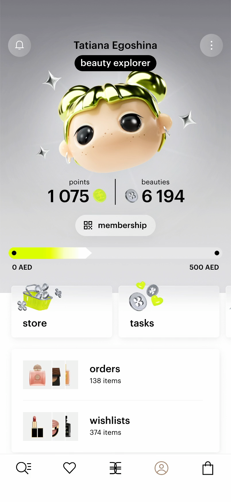
Membership was my team's biggest bet at Gold Apple. Before, every customer had the same status, no matter how often they shopped. We rebuilt the program from scratch around purchase frequency, AOV, LTV, and churn.

I designed the new account and the membership system around it: four tiers with their own perks, an in-app currency, tasks, and a store with limited drops. The challenge was to keep a complex loyalty economy simple.

Expressive 3D characters gave each tier a personality, and an interactive gift reveal made every new level feel earned.

The launch contributed 9.8% of the company's total GMV and enabled expansion into MEA and China. Purchase frequency grew 13%, and LTV rose 9%.

Book a call with Ilia

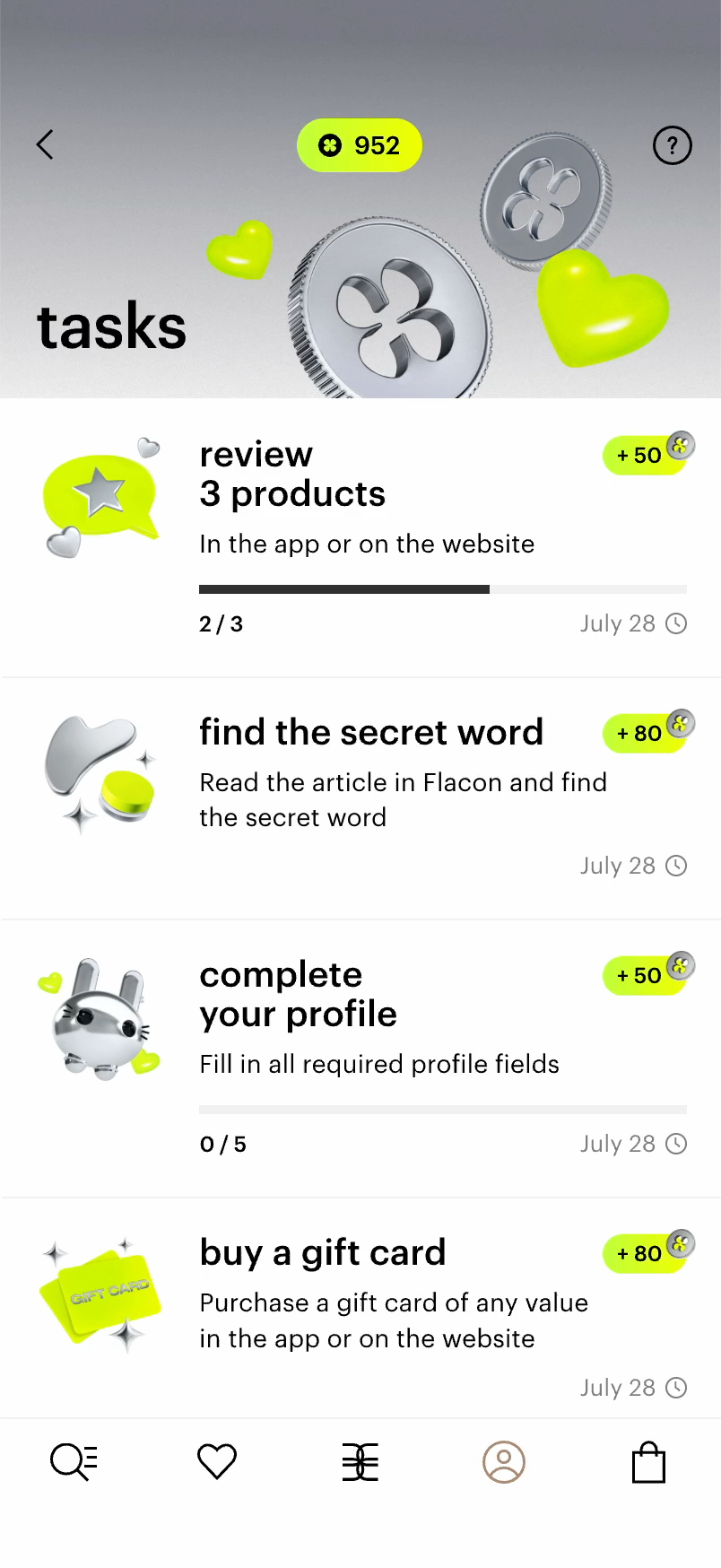
Tasks introduced an entirely new behavior to membership: earning a new in-app currency through challenges beyond shopping. There was no existing pattern to build from, so we designed the core loop ourselves.

The hardest part was the range of actions. Purchases, profile completion, and editorial interactions are very different actions. We made them feel like one engagement loop: action, progress, reward.

I took Tasks from rough early ideas to a full section of the app, one that fit naturally into the rest of Gold Apple.

Partner challenges let brands and customers discover each other directly. Brands became part of the experience instead of advertising around it. More than 100 brands joined, and the calendar was booked months ahead. Each month, 82% of active members completed at least one task. Tasks also set the stage for our next launch, the Store.

Book a call with Ilia

Tasks gave members a new way to earn. Store gave that value somewhere meaningful to go.

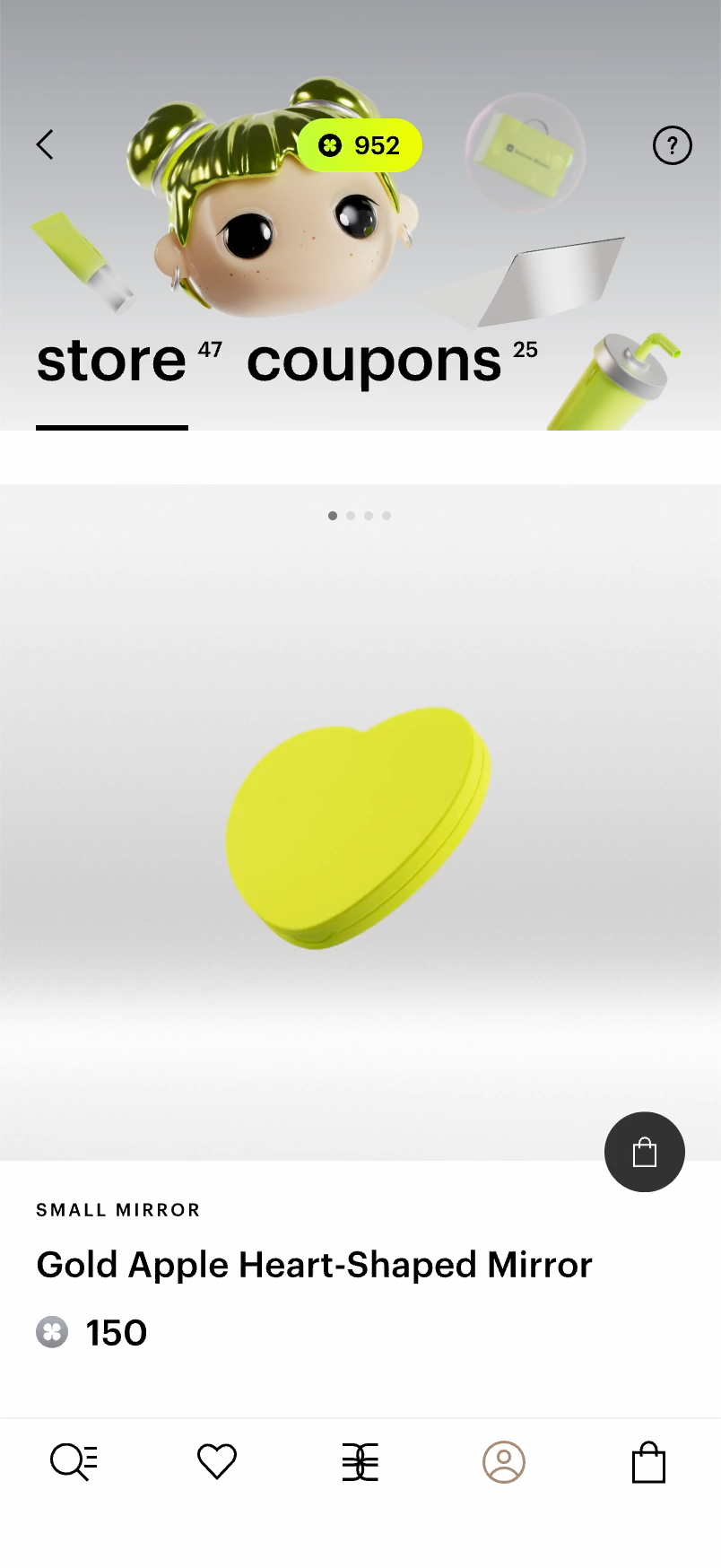
My team and I designed Store from the ground up. Members could spend the new in-app currency on exclusive products, coupons, promo codes, and brand collaborations. The range included a core collection, limited drops, and digital rewards.

The trickiest part was telling the two economies apart. Store had to feel clearly different from the main catalog, where people pay real money, yet still feel like Gold Apple. We kept the balance always visible and separated reward value from price.

Playful product animation gave Store its own character, and coupons connected it back to everyday shopping. Members spent 55% of the currency they earned there. The first drop of 20 products sold out within an hour, and soon people were reselling them on classifieds for real money.

Book a call with Ilia

Wishlists had long ranked among the top three requests in our twice-yearly research. People wanted more than a place to save products. They wanted to sort favorites into lists and share them, especially as gift lists before the holidays.

I led the work to turn Favorites from a private list into a social shopping feature. We added multiple lists, personalization, and sharing. We built on a habit people already had.

Shared lists also opened a new monetization surface. They became a natural format for brand collaborations, product placement, and editorial campaigns.

Within nine months, 13.5% of users had shared a list. Shared lists converted at 3.79%, against 1.35% for regular favorites,and wishlists drove 1.2% of total GMV.

Book a call with Ilia

Games had spread across the app over time. Different teams built them; entry points were scattered and sometimes hidden, and bugs were common. Users struggled to find them, and nobody owned the whole experience.

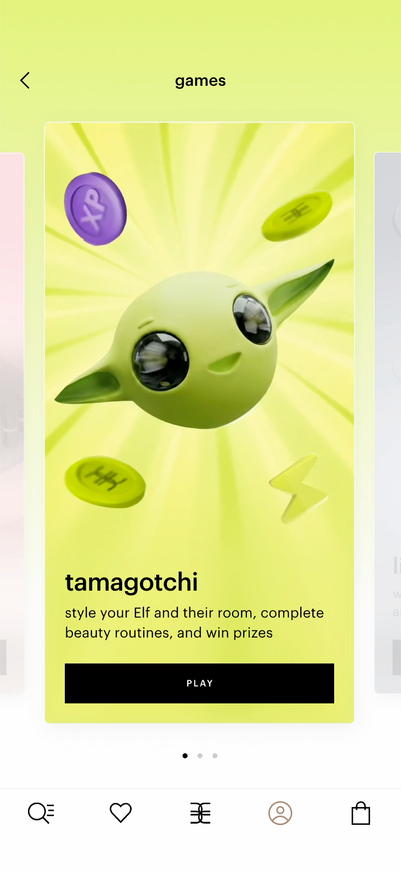
I turned that sprawl into one system. I aligned stakeholders around a single dedicated games team. Then we created one Games destination in the account, giving every title a clear and permanent home.

A standard listing felt too flat for something that is both entertainment and a commercial surface. We built the experience around a carousel of native 3D worlds. Each game got its own character, and brands got a more expressive space for native integrations.

With one team and one system, new games shipped faster. Traffic to games rose 44%, and members finally knew where to find them.

Book a call with Ilia

As Gold Apple expanded into the Gulf, China, Kazakhstan, and Belarus, the product couldn't simply be translated. Each market had its own expectations around navigation, shopping, gifting, and language.

We researched local patterns market by market, then rethought flows, hierarchy, and interactions wherever a direct translation wouldn't have felt natural.

In Arabic markets, right-to-left design changed more than the layout. Local norms discourage asking for gifts openly, so we reworked wishlists around how people actually share. In China, we built a dedicated experience that was compact and dense, the way local users expect.

The goal was never a product that looked translated. It was the same product, native wherever it appeared.

Book a call with Ilia

Avito — Marketplace Design

Company

Avito is a $1B+ classifieds platform with around 27 million daily users. It connects millions of private and professional sellers with buyers.

Contribution

As Staff Product Designer, I owned the design of two big bets: Mall, a space for new items from trusted sellers, and a family of pricing tools for sellers. I worked across two discovery and two delivery teams at once. I defined the problems with product and analytics and took each solution from first sketch to rollout.

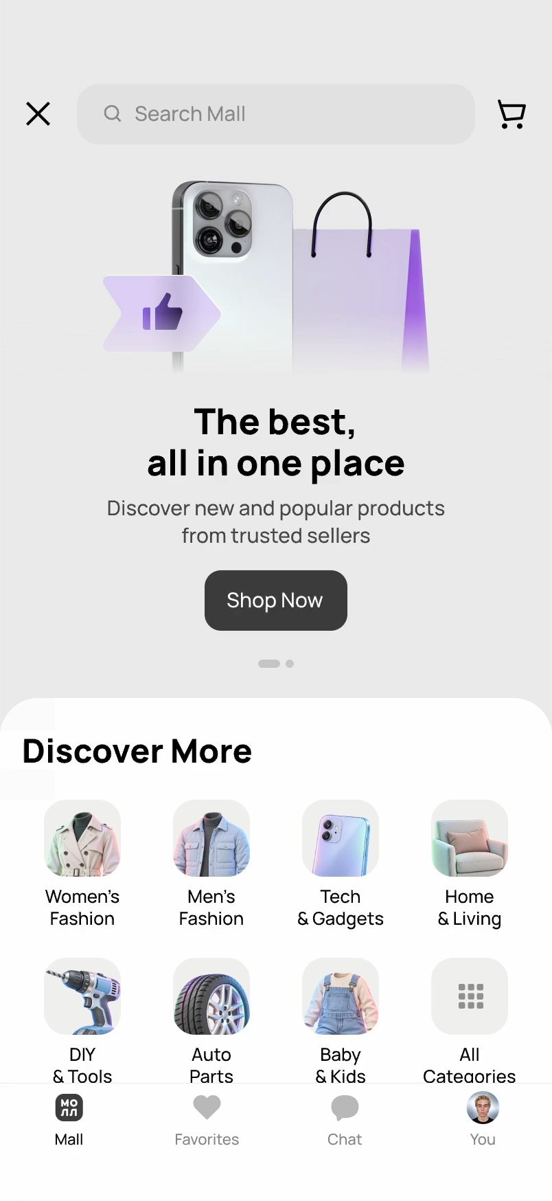
Avito had a reputation problem. For many buyers, it was still a flea market. Mall was our answer: a dedicated space for new items from verified sellers.

The first version didn't hold people. Two out of three visitors left without opening a single item. Research showed why: the assortment was pricier and less relevant than the main feed.

We kept only new items from trusted sellers and built the homepage around bestsellers, using social proof. I also art-directed Mall's identity, giving it a premium feel while keeping it clearly Avito.

The repositioning paid off. Contact conversion grew 74%. Product views rose 5.1%, add-to-cart 20.5%, and purchases with delivery 26%.

Book a call with Ilia

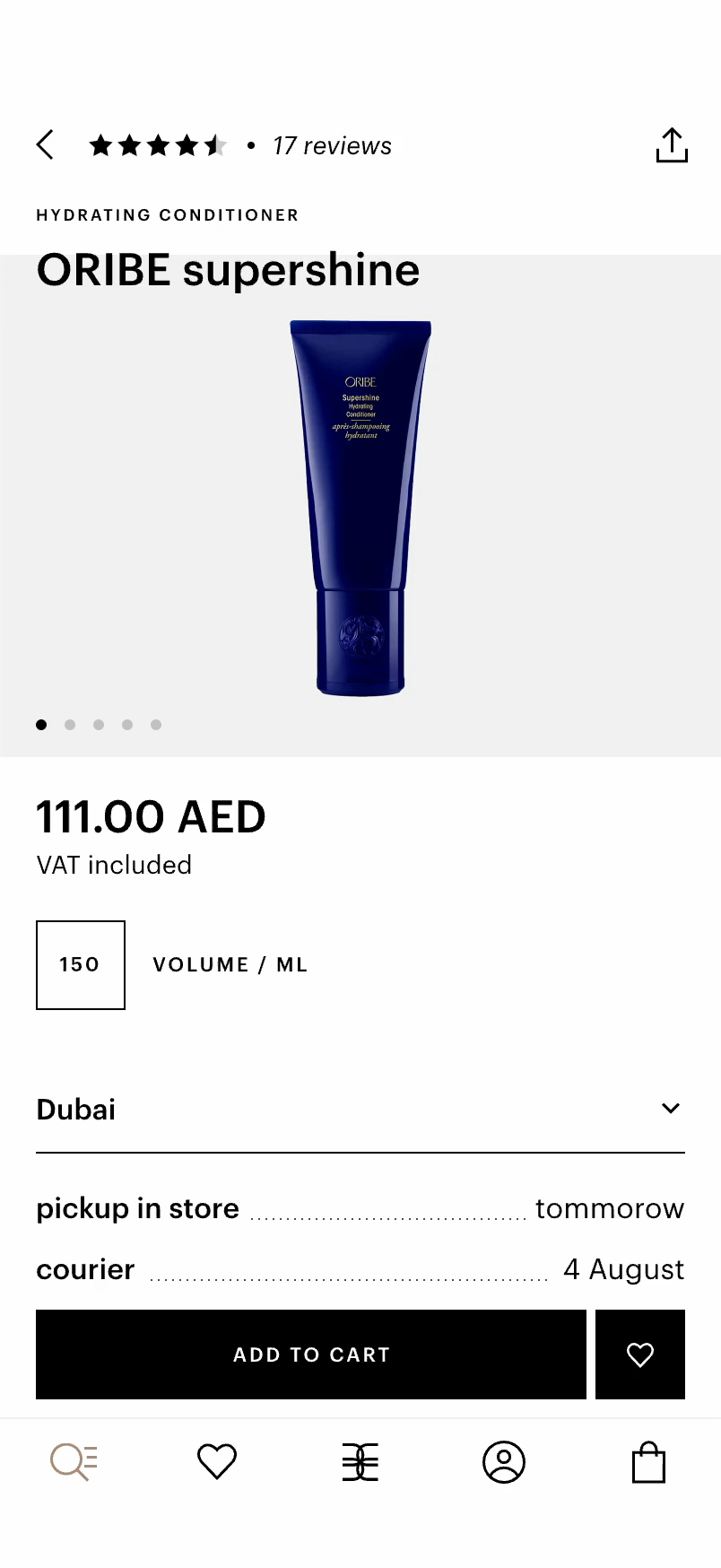
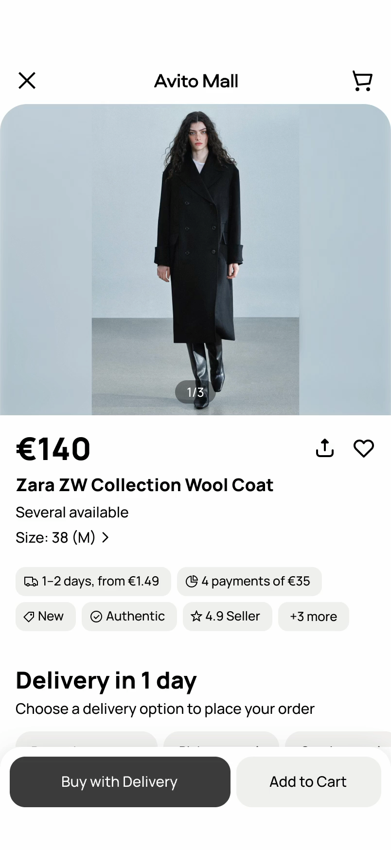
A product page in Mall looked exactly like any other page on Avito. Buyers had no way to tell they were looking at a new item from a verified seller. The page itself hadn't been updated in years, and its structure had grown cluttered.

I started with the sense of place. I brought Mall's identity to the top of the page and gave Mall its own navigation, so it felt like an app within the app. Once inside, buyers could see they were in a protected space.

Then I brought order to the page. I added new blocks for delivery and installment payments and rebuilt the information hierarchy around the purchase decision. New category navigation made it easy to keep browsing similar items.

The new page made the purchase decision easier. Conversion grew by 3.8%, orders with delivery rose by 12%, and orders paid in installments rose by 8%.

Book a call with Ilia

Price is the main reason people choose where to buy. Avito wanted to win on price against the big marketplaces, but prices were set by sellers, and sellers naturally want to sell at a high. We needed a way to move prices without forcing anyone.

Price Index was a separate workstream with its own team. Under the hood, models matched each listing with the same product across the web.

I designed the dashboard that turned this data into an actionable signal for sellers. In seconds, they could see how competitive their price was and what to do about it. Some had priced too low and could earn more. Most saw cheaper offers elsewhere and a simple reason to adjust: a lower price meant a faster sale.

It worked both ways. Sellers got a tool that helped them sell faster and smarter. Overall, 17% of sellers opened the dashboard, and 2% changed their price. Average prices on Avito dropped 7% without a single rule or penalty, and lower prices gave buyers more reasons to come back.

Book a call with Ilia

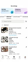
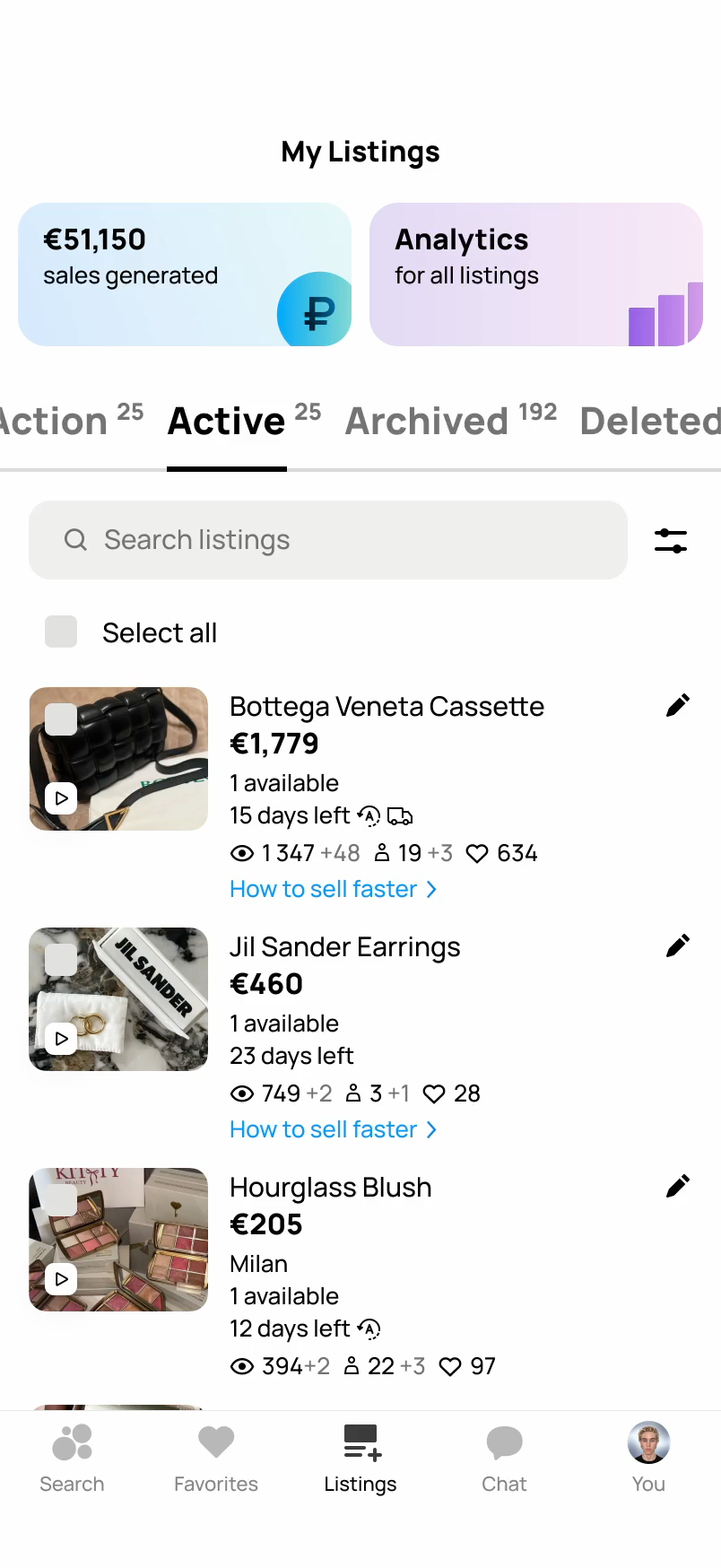
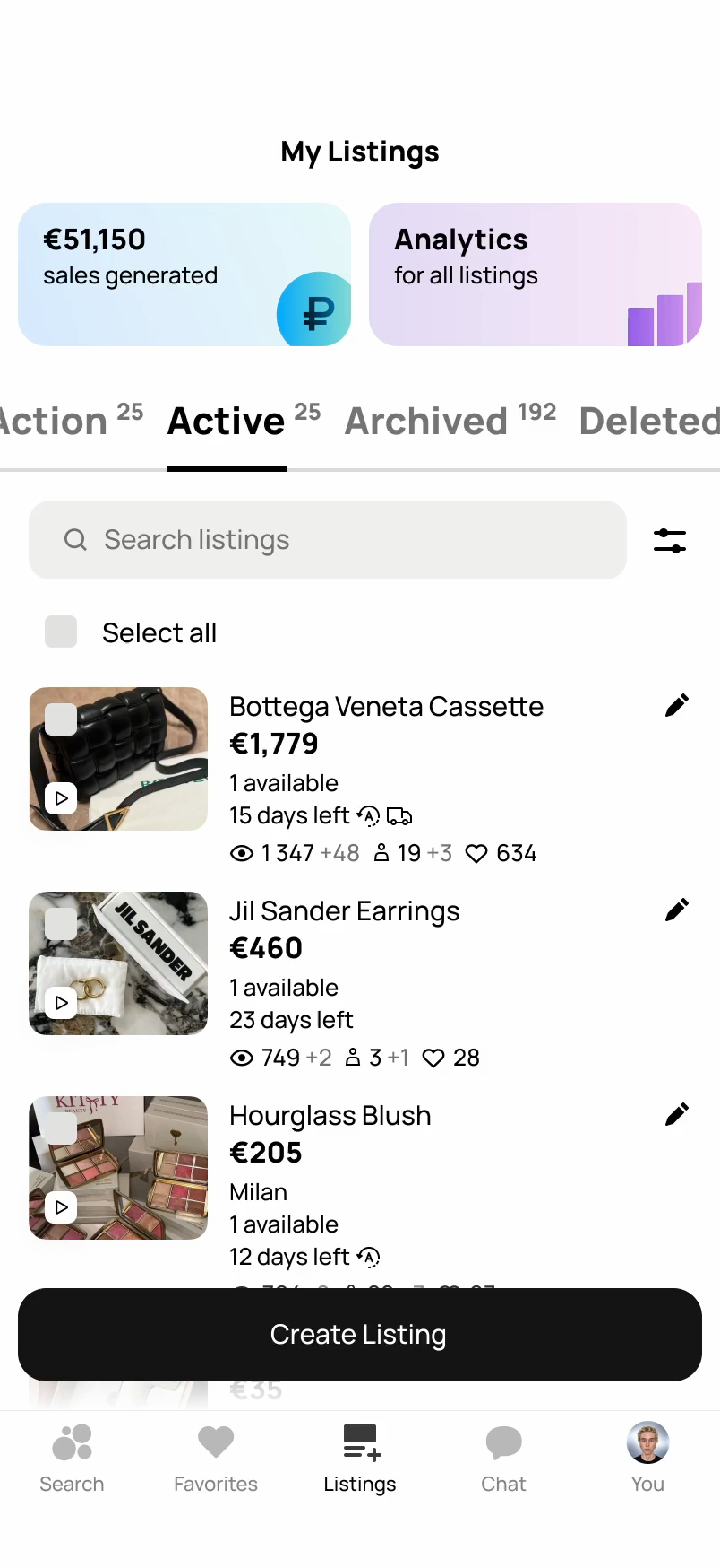
Many sellers on Avito are regular people selling things they no longer need. When a listing gets no replies, they rarely know why, and they rarely think to change the price. The item just sits there.

Purchase boost was a nudge timed for that moment. If a listing went about a week without contacts, sellers saw a simple prompt in My Listings: how to sell faster. It explained, in plain words, how a fairer price could bring buyers in.

I designed the prompt to feel like friendly advice, not a warning. No pressure, no penalties, just a clear next step at the moment it mattered.

The results went far beyond the plan. Usage reached 1.5% of sellers, against a goal of 1%. The median price drop was 25%, five times more than expected, and the share of sellers who lowered prices grew by 13%. It rolled out to all sellers.

Book a call with Ilia

Most people on Avito sell things that don't have an exact model or a list price. When it came time to set one, they faced an empty field that just said: "Enter a price." So they left the app and searched online for what something similar might cost.

Recommended Price brought that research into the listing flow. It covered the categories where Avito's existing price guidance couldn't reach.

As soon as a seller types the title, they see similar listings with real prices and the typical range. Setting a market price became part of creating the listing.

The A/B test hit its success metric. In the test group, 30% of sellers used the hint, and 4% set a price at least 10% lower than sellers in the control group. Together with Price Index and Purchase Boost, it gave Avito a full set of pricing tools, from the first listing to the last nudge.

Book a call with Ilia

MTS Workzen — Work Management

Company

MTS is a $7B+ telecom and digital ecosystem with over 80 million customers. Workzen was one of its products: a task manager for small and medium-sized businesses and freelancers.

Contribution

As Senior Product Designer, I owned Workzen's end-to-end design, from a new identity to every screen across the app and website. I turned an early MVP into a full product with time tracking, analytics, and team roles.

The first version of Workzen was built to launch fast. The UI felt dated, the navigation didn't follow a clear logic, and key features were missing.

I started with the information architecture. I rebuilt the navigation around three core jobs: managing tasks, working with clients, and checking reports.

Workzen became a full work hub, not justa to-do list. Tasks open as a list, a Kanban board, or a calendar, and clients, time tracking, and reports are built in. Small teams no longer need a separate CRM, planner, and spreadsheet.

Smart lists put the most relevant work first, and projects sit right below. People came back far more often. Daily active users more than doubled, weekly users grew 66%, and monthly users grew 48%.

Book a call with Ilia

The task screen is the heart of Workzen. It looks simple, but behind it sit dozens of complex flows: statuses, assignees, watchers, deadlines, subtasks, comments, budgets, clients, and time.

In the first version, a task was little more than a title and a date. Real work needs much more, and every new piece of information makes the screen harder to read.

I mapped every flow and edge case and designed how they connect. The most important details sit at the top, and everything else is one tap away. Subtasks break big jobs into clear, trackable steps.

It's a pro-level task manager that still feels light. People created 24% more tasks per week, and the share of tasks closed on time grew by 7.5%.

Book a call with Ilia

Small business owners had no visibility into team performance. Workzen showed tasks, but not the bigger picture.

Analytics didn't exist before, so I designed it as a new core section. Reports show what got done, what's on time, and what's overdue for the whole team, each client, or just you.

Tracked time and billable hours sit in the same view, so owners can see where the time goes and what it earns. A weekly chart shows how the team's work moves day by day.

It turned Workzen from a to-do list into a tool for running a business. The share of owners who checked reports every week grew 32%.

Book a call with Ilia

Freelancers and small teams bill by the hour, yet they tracked time somewhere else, or not at all.

I designed time tracking and built it into the core workflow, right in the task list. A swipe starts a timer or closes a task without even opening it.

Comments grew into a full team messenger. People chat, share files and documents, and keep every conversation tied to the task it's about. People no longer had to switch to other apps to talk about work.

Tracking time became part of everyday work. Tasks with logged time grew 47%; each task averaged three messages, and weekly stickiness rose 29% as Workzen turned into a daily habit.

Book a call with Ilia

Most Workzen users worked for clients, but the first version had no place for them. Client work was scattered across projects and tags.

I made clients a first-class entity in the product, with their own tab in the main navigation. Each client has a card with their open tasks, so it's easy to see where things stand.

Clients connect to tasks, time, and reports. In one place, you can see all the work for a client and how much time and money it took.

It caught on fast. The share of spaces with at least one client grew by 60%.

Book a call with Ilia

On the surface, roles are just a list of people. In practice, they're one of the most complex parts of Workzen. There are many roles, each with its own access to tasks, clients, reports, and settings.

We started with research and analytics to understand how real teams share work and who needs to see what. Then I designed the role model from scratch and built a permissions matrix across the product.

Spaces keep personal work and different teams apart, and each space has its own members and projects. Switching between them takes one tap, so freelancers can keep personal and client work side by side.

Workzen could now grow with the business, from a single freelancer to a whole team. The share of team spaces grew 12%.

Book a call with Ilia